5 reasons your website is not standing out!
Scroll to main content
From poor user experience or unengaging content, evaluating these aspects can help identify and resolve the problems preventing your website from achieving its goals.
These are our top 5 common mistakes that businesses make when it comes to their website.
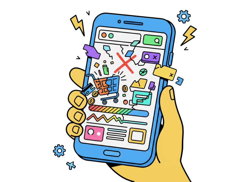
No matter how good your website looks on desktop, if it doesn’t work on mobile, you could be losing almost 65% of your potential customers.
Depending on your target audience, users will most likely first access your website on mobile via social media. If your website hasn’t been optimised for mobile, this gives them a poor user experience, making it unlikely they’ll check again on a desktop device.
Look out for
Have you ever looked at a website and their last blog post was from 2015? If you aren’t keeping your website up to date, users may assume your information is no longer relevant and search for another provider instead.
By updating your website consistently, be it with case studies or thought leadership pieces, this gives the customer confidence that you are an expert in your field.
Not only is it good practice, it can help boost your SEO! By posting on socials about new items on your website, this drives traffic to your website and can help increase your organic ranking. Search engines such as Google will also prioritise websites it thinks are regularly updated with fresh & high quality information. Win Win!
However, don't think you just need to add new stuff, this is a good opportunity to review other pages and make sure this is still correct as well. Our favourite is seeing About Us pages that mention 'X years of experience' but in reality they've been going for much longer and have just forgotten to update this!
Also with attention spans getting shorter, make sure your pages are not too long to scroll. See point 4 about cluttered layouts
We love describing websites as your online brochure or shop front. It should go without saying, but your web presence is another extension of your brand. When a user lands on the homepage of your website, do they get a snapshot into who you are and what you do?
Branding and design is extremely important, not only for your website but for your business. It's important that your 'look' is tailored to your audience in order to build that connection with your customers. If your website doesn't have a clear brand identity you won't reach the ideal audience that you need for your business to grow. Of course we are biased to websites, but also think about your social media, business cards, email signatures, physical brochures - anything that has your name on it should be consistent with your brand.
We all want to be McDonalds, when you see the golden arches, you know exactly who it is! You may already be fortunate enough to be a stand out in your sector, but if your goal is to increase your brand awareness it may be time to review your guidelines.
It's easy to just think of your brand as the logo & colours, but have a look at your competitors, if you were just to change these elements would your websites appear the same?

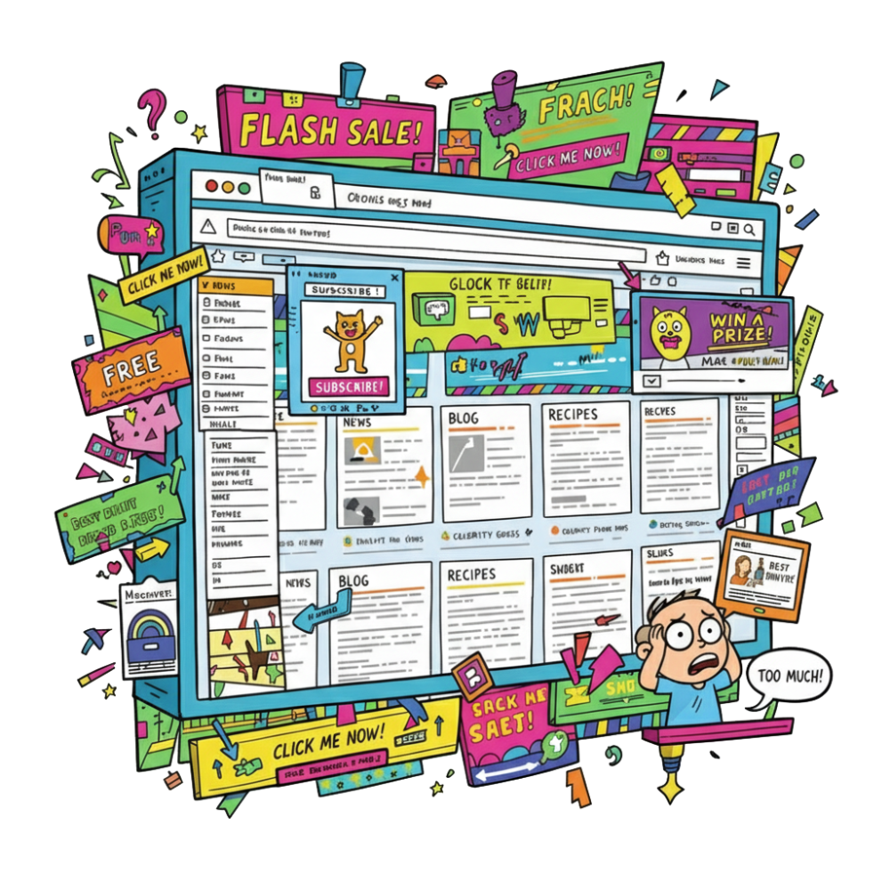
Ever landed on a website that's just a complete mess? Information overload, competing visuals – does your brain even know where to look? That cognitive overload quickly leads to frustration, right? And what happens then? You leave! You don't engage, you don't buy, you just abandon ship.
Streamlining your website into a clean and simple layout doesn't have to be boring. Utilising your brand and clear call to actions, you can still create a unique yet organised website that guides the users attention to the right elements. When being more thoughtful with your elements and placements you create a clear user journey to follow.
Often users visit a site with a goal in mind and it usually boils down to simply finding information. For example on a shop, a user wants to easily filter and search through products as well as review their orders. Make sure your navigation is well-defined and pages grouped intuitively to avoid multiple clicks and frustration. Keep pages streamlined just to the information required with a handful of buttons to continue the journey in the way they want to.
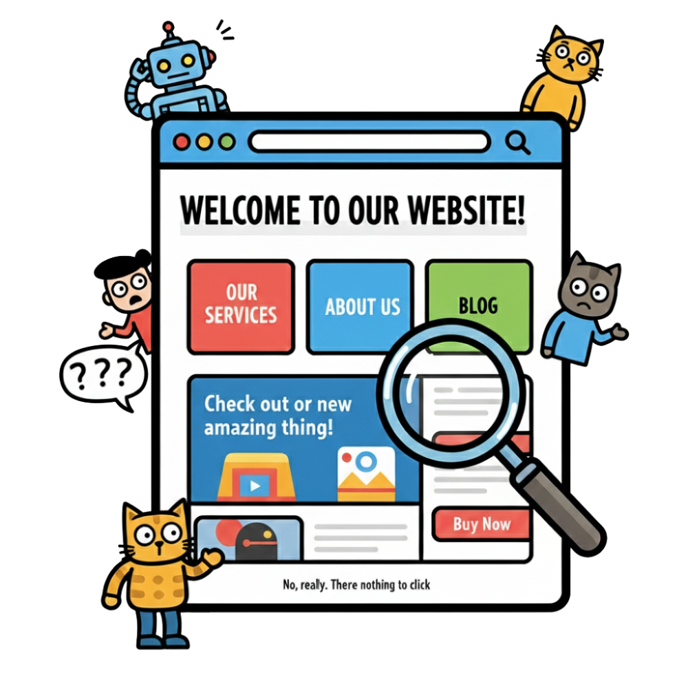
So, you've got a fantastic website, but are your calls to action actually working for you? If your users don't know what to do next, how can they take advantage of what you're offering?
You want those calls to action to pop! Make sure what you offer is clear, and right there with it, a button to click. Something like "Book a Meeting" or "Give Us a Call" with your contact details clearly visible. Don't leave them guessing!
However similar to the point above about a cluttered content, don't overwhelm the user with lots of buttons. Calls to actions should make sense to the page the user is on. If you are describing a service, the main call to action should be 'get in touch for a quote', not 'contact us' and 'see our other services' and 'call us here' and 'download our brochure' and on and on.